How to Make Your Health and Safety Signs Unmissable
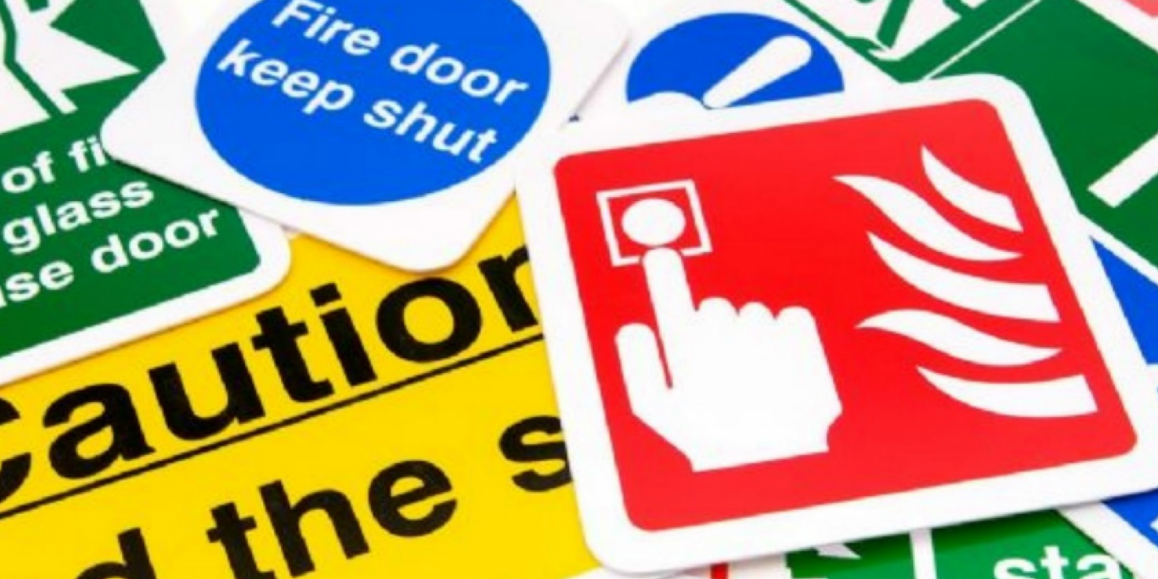
We are all used to seeing health and safety signs in public spaces. They come in an endless variety of forms, but they share the same purpose – to prevent accidents. So, it might come as a surprise to learn how little care some businesses take designing their safety signage. Many see it only as a mandatory requirement and invest the minimum in time and money.
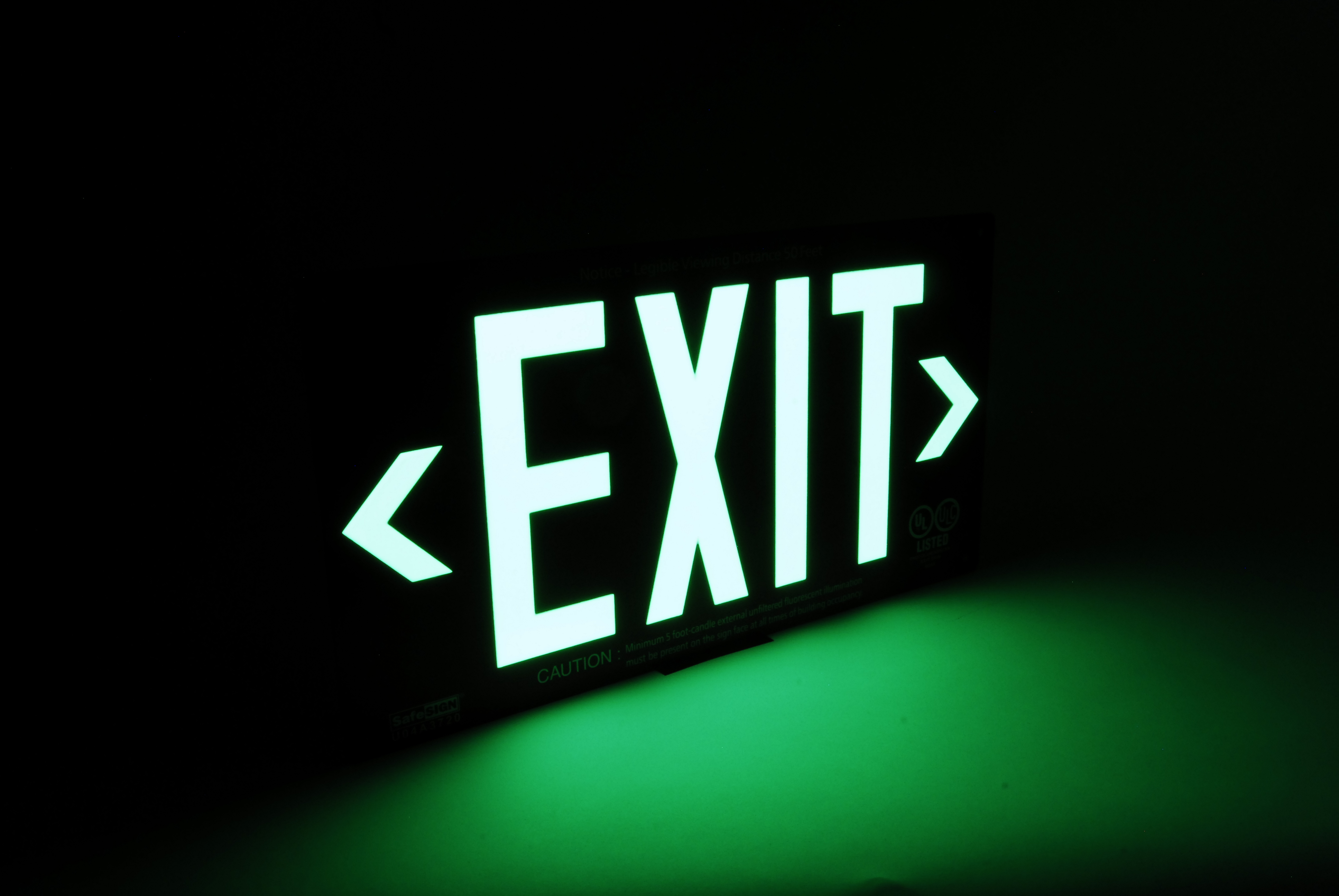
Yet, the notion that skimping on safety signage leads to savings is a false economy. By investing in high-quality signs in Braintree, you are telling customers that you care. It sends a message that the company is professional and performs at a high level. From emergency exit signs to trip hazard notices, and advice on using escalators, health and safety is a big asset.
Keep reading for tips on how to make your safety signage stand out and have a big impact.
Keep It Simple
For all signs, be they promotional or otherwise, brevity is essential. The purpose of a sign is to inform quickly. It is not a brochure or a leaflet. You have to get your information across in a handful of words (often two or three). Omit all extraneous information and be direct.
It is even more important for healthy and safety signs, which have to be universally interpreted. This is one of the reasons why pictograms are so effective. They represent an entire instruction or warning with a single image.
Choose the Right Font
If you are going to use text, the font has to be clear and easily readable from a distance. It is much more appropriate to make letters very large on health and safety signs, so test out the viability of your design by trying different fonts.
On the other hand, it is also important to match the font and size to the context. For instance, an emergency exit sign is relevant to everybody on the floor of a building. However, a ‘Keep Right On the Elevator’ sign only needs to be seen by those close enough to use it.
Use Bright Colours
The use of bold colours is always recommended for signage because they get noticed. Health and safety signs in Braintree are no exception, but it is best to stick to one clear tone. Take advantage of contrasts. For instance, red and black are a classic combination, because they contrast with one another and information is easy to see.
It is also worth remembering that red is associated with danger, so it works particularly well for warning signs. Green is linked to natural entities and the environment, which makes it an excellent choice for recycling notices and the like. Yellow is another useful option, as it is vibrant and hard to miss no matter whether you are shopping or meeting with a client.
Get a Designer to Help
If you want to ensure that your signage is perfect, you can enlist the services of a professional design team. This is a good idea for businesses of all sizes because it guarantees an effective end product. You still get your own creative input, but all work – be it promotional, health and safety or otherwise – comes with expert advice.
These services have been responsible for some of the best commercial signs in Braintree, so it is worth considering outside help. Designers put a lot of time and research into the little details. They think about the psychological effects of colours, font choices, spacing, imagery, dimensions, and more. Plus, some companies offer a free consultation.
For more advice on designing health and safety signs, visit Envirosigns. Or, call 01206 845 515 to speak to a representative and get a cost estimate for your project.

